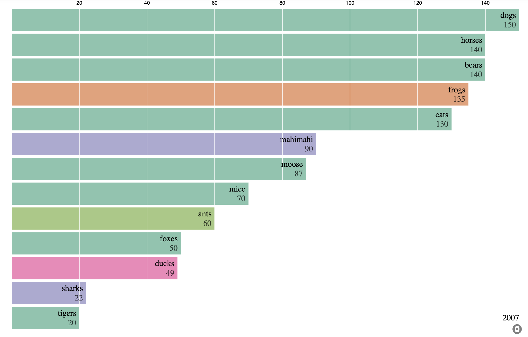
Barchart Race
Bar Chart Race is a great and highly visual way to display data changing over time in the form of an animated bar chart. It’s a very comprehensible representation of time-based changes in data.
Set Up
Before Starting make sure to have Observable-Jupyter and any other needed libraries installed in your local environment.
[19]:
from observable_jupyter import embed
import pandas as pd
import json
Load and Format Data
[20]:
Barchart_df = pd.read_csv("Demo_Data/toy_data_set.csv", index_col = None)
[21]:
Barchart_df.head()
[21]:
| Date | Animal | Category | Value | |
|---|---|---|---|---|
| 0 | 1/1/00 | dogs | mammal | 100 |
| 1 | 1/1/00 | cats | mammal | 30 |
| 2 | 1/1/00 | frogs | amphibian | 5 |
| 3 | 1/1/00 | mahimahi | fish | 6 |
| 4 | 1/1/00 | mice | mammal | 10 |
The following block of code structures the data into a format accepted by Observable.
[22]:
result = Barchart_df.to_json(orient="records")
parsed = json.loads(result)
data = json.dumps(parsed, indent=4)
Formated_Data = json.loads(data)
Embed your data into the visualization
The Barchart Race visualization consists of two cells:
chart : chart cell displays the animated bar chart race.
viewof replay : viewof replay is responsable for displaying the replay button.
To make your visualization work you will need to access the input variables.
csv_data : set csv_data equal to your structured data.
date_column : set to the name of your date column.
name_column : name_column is set to a unique identifyer for data.
value_column : value_column is set to the quantitative value you wish to measure.
category_column : if you have catagories in your data set category_column equal to the name of the column contiaing your catagories.
n : n is responsable for deciding how many items will be in the race.
[23]:
embed(
    '@rstorni/bar-chart-race-observable-jupyter-demo',
    cells=['chart', 'viewof replay'],
    inputs = {
        "csv_data" : Formated_Data,
        "date_column" : "Date",
        "name_column" : "Animal",
        "value_column" : "Value",
        "category_column" : "Catagory",
        "n" : 10
     }
)