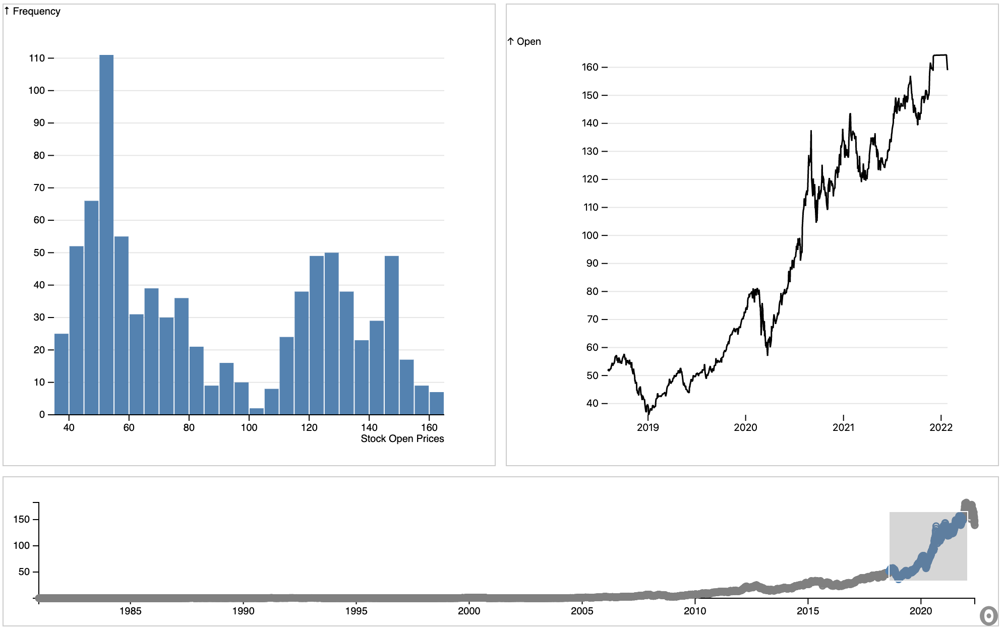
Timeseries Dashboard
Creates a dashboard with a brushable scatterplot that drives the visualization of both a line plot and a histogram.
Set Up
[4]:
from observable_jupyter import embed
from sklearn.datasets import load_breast_cancer
import pandas as pd
import json
Load and Format Data
[20]:
stocks_df = pd.read_csv("Demo_Data/Apple.csv")
stocks_df.head()
[20]:
| Date | Open | High | Low | Close | Adj Close | Volume | |
|---|---|---|---|---|---|---|---|
| 0 | 1980-12-12 | 0.128348 | 0.128906 | 0.128348 | 0.128348 | 0.100178 | 469033600 |
| 1 | 1980-12-15 | 0.122210 | 0.122210 | 0.121652 | 0.121652 | 0.094952 | 175884800 |
| 2 | 1980-12-16 | 0.113281 | 0.113281 | 0.112723 | 0.112723 | 0.087983 | 105728000 |
| 3 | 1980-12-17 | 0.115513 | 0.116071 | 0.115513 | 0.115513 | 0.090160 | 86441600 |
| 4 | 1980-12-18 | 0.118862 | 0.119420 | 0.118862 | 0.118862 | 0.092774 | 73449600 |
The following block of code structures the data into a format accepted by Observable.
[7]:
result = stocks_df.to_json(orient="records")
parsed = json.loads(result)
data = json.dumps(parsed, indent=4)
Formated_Data = json.loads(data)
Embed your data into the visualization
The Timeseries Dashboard consists of one cell:
grid : Depicts the map and the associated data
To make your visualization work you will need to access the input variables:
csv_data : Set equal to your formated data
Qval_column : Should be set to the name of the column containing the quantitative data you want to display.
title : Title of the representing what is being measured in Qval_column
[19]:
embed("@rstorni/interacting-charts",
     cells = ["grid"],
     inputs = {
         "csv_data" : Formated_Data,
         "title" : "Stock Open Prices",
         "Qval_column" : "Open"
     }
)