Leaflet United States Choropleth Map
Leaflet is an open source javascrip library for interactive maps. Used by companies like NPR, Github and Financial Times the Leaflet United States Chloropleth Map allows you to make a publication quality choropleth map
Set Up
[2]:
from observable_jupyter import embed
import pandas as pd
import json
Load and Format Data
[3]:
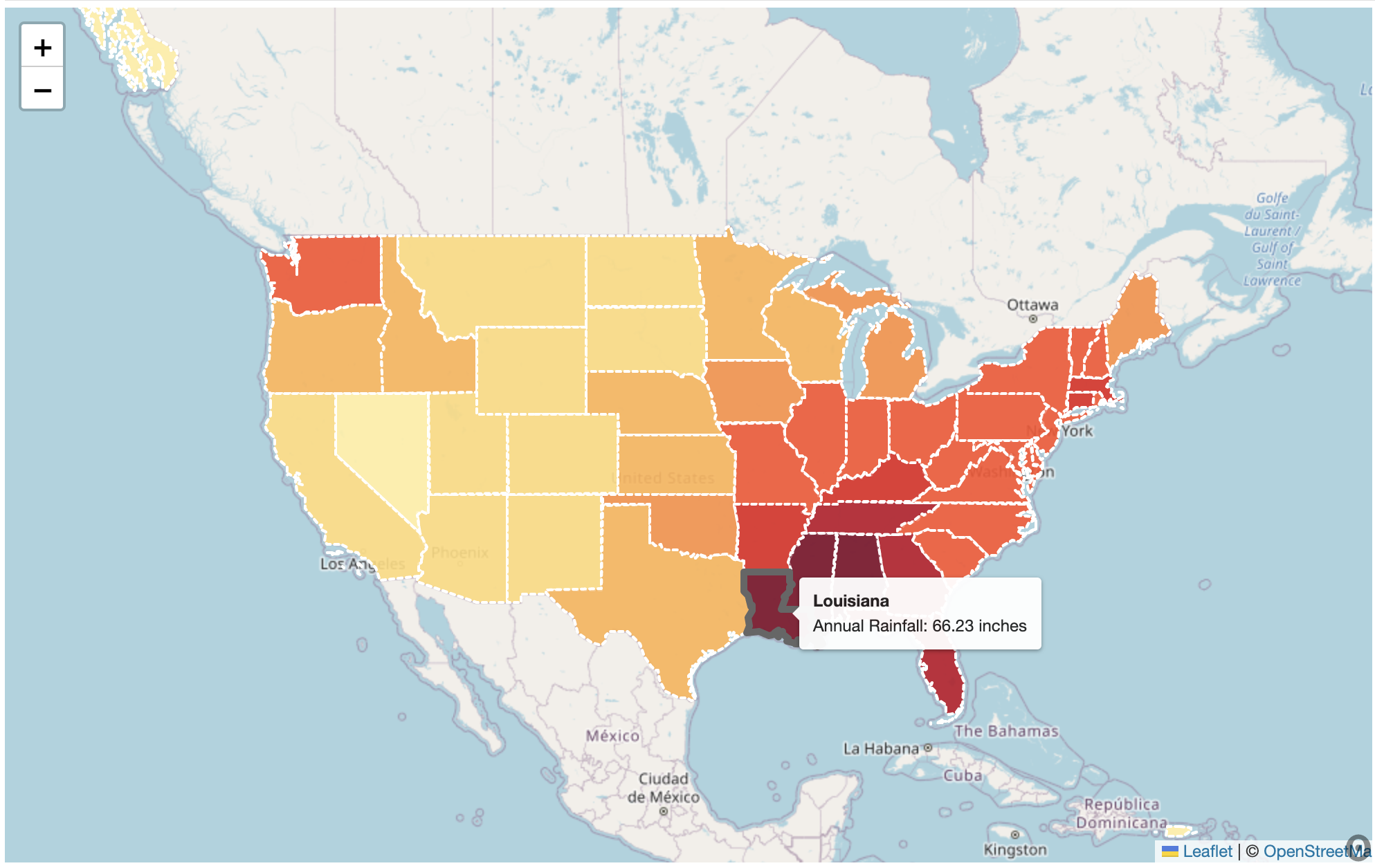
rain_df = pd.read_csv("Demo_Data/Rain_Data.csv")
rain_df.head()
[3]:
| State | RainFall (in) | |
|---|---|---|
| 0 | Mississippi | 66.84 |
| 1 | Louisiana | 66.23 |
| 2 | Alabama | 65.06 |
| 3 | Tennessee | 58.89 |
| 4 | Georgia | 57.11 |
The following block of code structures the data into a format accepted by Observable.
[4]:
result = rain_df.to_json(orient="records")
parsed = json.loads(result)
data = json.dumps(parsed, indent=4)
Formated_Data = json.loads(data)
Embed your data into the visualization
The Leaflet United States Choropleth Map consists of two cells:
map : Depicts the map and the associated data
leaflet : Depicts the checklist filter tool
To make your visualization work you will need to access the input variables:
quantitative_data : Set equal to your formated data
ID_Column : set equal to the column that contains your state names
Quant_Column : Should be set to the name of the column containing the quantitative data you want to display.
toolTip_title : List of strings where index 0 should discribe the quantitiative data and index 1 should contain units.
Levels : List of length 7 representing different cutoffs for colors depicted on the map
[5]:
embed("@rstorni/leaflet-map",
     cells = ["map", "leaflet"],
     inputs = {
         "quantitative_data" : Formated_Data,
         "ID_Column" : "State",
         "Quant_Column" : "RainFall (in)",
         "toolTip_title" : ["Annual Rainfall", " inches"],
         "Levels" : [10, 20, 30, 40, 50, 55, 60]
     }
)